


When you love talking to production designers or really any extraordinarily talented artisan, you certainly don’t want to offend them.
Yet, sometimes, you think you’re being extraordinarily clever with what you believe are apt observations about their designs and their sources of inspiration. Case in point: Yorgos Lanthimos’s Poor Things accompanies its brilliant performances with a visual tour-de-force in production design. The film takes place in a world that ranges from slightly off-kilter from our reality to wildly inventive locations that truly feel detached from the world we know.
Just don’t call it steampunk.
“The one thing we decided we wouldn’t look at and we wouldn’t do would be steampunk, but it’s okay. We’ve gone to therapy. We’re okay, but that was exactly what we’re trying not to do,” production designer Shona Heath admitted. “When you start with a Victorian-ish era, we’ve got electricity, and we’re looking to the future then maybe that’s where the territory becomes slightly familiar. But we were looking at actually Victorian futurists like Albert Robida who drew scenes during the Belle Époque with a nod to sci-fi. We were looking at things that were done in the Victorian era looking forward rather than in the 90s looking back.”

Prior to looking to futurist artists like Robida, Heath and production design partner James Price started with Tony McNamara’s brilliant screenplay. Based on the novel of the same name by Alasdair Gray, Poor Things combines the literary inspirations of Pygmalion and Frankenstein to create a story about Bella Baxter, a reanimated woman played by Emma Stone. Over the course of the film, Bella, initially seen with the mind of an infant, matures at an exponential rate and travels across the world to seek knowledge, experience, and her own sense of independence.
McNamara’s script, according to Heath and Price, beautifully oriented the team in Bella’s perspective and contained dozens of clues about how to realize her elaborate world. Plus, director Yorgos Lanthimos set out to build the film using craft techniques stemming from the 1930s but with modern technology. Those points of direction allowed the production design team to exercise the freedom to create their own world without relying on any established environment.
Lanthimos begins the film with Bella’s “father,” Dr. Godwin Baxter (Willem Dafoe), and his laboratory, but these early scenes are all realized in stark black and white. Normally a good thing for a production designer to know ahead of time, the usage of black and white ended up being a surprise to the Heath and Price.
One that had unfortunate side effects.
“We actually didn’t know [Yorgos] was going to be shooting in black and white. He talked about shooting some scenes in black and white, but the original plan was to shoot the animation and the flashback at the beginning black and white. Yorgos and Robbie [Ryan, cinematography] did a lot of camera testing and shooting different stocks and cameras, different formats. He loved the black and white look in these tests, so he finally decided to shoot [Baxter’s lab] in black and white,” revealed Price. “Looking back on it, we kind of think he knew all along that he really wanted to shoot much more than what he was saying in black and white. He encouraged us from the get-go to just put more texture into the set. The texture becomes the shape, especially when you’re lighting for black and white. It’s that deep, deep detail in the architecture.”
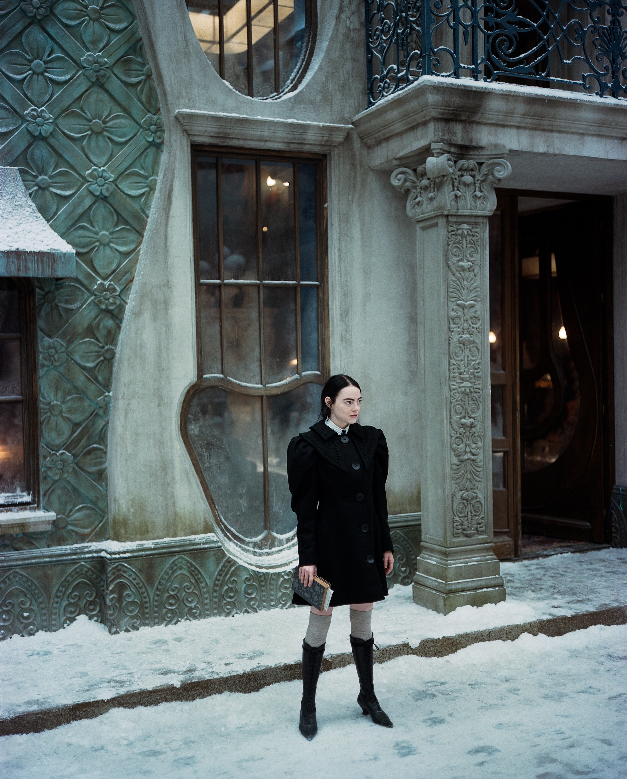
However, if the production design team had known the initial scenes would be filmed in black and white, then they perhaps would have designed Bella’s room in a slightly different fashion. The original, color-friendly design included some striking, silk and crushed velvet curtains. The color of the curtains started with a type of medical green that flowed into raspberry tones before ending in blood red at the bottom. Of course, you can’t see this detail in black and white.

Still, the initial black and white-toned sequences offered the gorgeously rendered Baxter’s laboratory set. The scenes harken back to the early days of cinema, particularly James Whale’s Bride of Frankenstein. Heath and Price looked at that film among others for not only its German expressionist stylings but also for its infamous reanimation scene. Whale’s film inspired the team less for its literal space but more for its overall sense of theatrical drama.
The inspiration allowed the production design team to follow Yorgos’s desire to blend 1930s filmmaking styles with modern technology. The hope was to develop a new visual aesthetic within the film. That’s another reason the team stayed away from direct steampunk influences within the design.
“We try to stay away from contemporary references and film references. Coppola’s Bram Stoker’s Dracula gets mentioned, which we did look at because they tried to make a movie in the 1990s in the style of a film made when the book was published, right around the birth of cinema,” Price explained. “We looked at their filmmkaing values and how they achieved something, but we increasingly looked at several artists rather than film itself. We wanted to try to avoid being so self-referential as films tend to do.”
Some of the designs were born out of necessity. For example, when Bella travels to Lisbon, those enormous sets were still not large enough to feature trams navigating the streets. To solve the problem of a lack of public transportation, Heath and Price decided to feature them traveling on wires in the sky. It also allowed for the trams, based on a snow plow design, to be built on a much smaller scale to provide a sense of perspective when Bella looks to the sky.
Other vehicles, as strange as they seem in the film, were inspired by actual period designs. A study of early American patents revealed that someone actually conceived of an early vehicle led by a constructed horse’s head. The idea was that people and horses drawing carriages would be terrified by the new “horseless carriages,” so the inventor believed cars front-loaded with a horse’s head would be more palatable. Of course, that had to be something the production design team would include in the film.
How could you not?
Another more cheeky design element comes when Bella briefly serves as a sex worker in France. She often spends time in front of windows that bare a striking resemblance to the male anatomy.
“That was an idea that we thought would be funny. We thought it would be funny that she of all people would look at this building that had carved beautiful naked women on the outside and penis-shaped windows, and she would still stride up to it quite happily. There was nothing to fear. There was no shame. That was just a building with some shapes, you know?” Heath laughed. “That was just a bit of the humor from the scripts blending into the designs since we built everything from scratch. Why not do something like that? Have fun and do things you don’t see in the real world because we had the chance to make it, which was why it was so playful and nobody told us not to.”
The penile windows also serve the story at the peak of Bella’s sexual freedom and growing independence. Many of Heath and Price’s production design similarly serve the story to help define the characters and their longer intensions.
But just don’t call it steampunk.
Poor Things opens nationwide on December 22.


![2025 Oscars: Can a Late-Breaker Still Win Best Picture? [POLL]](https://www.awardsdaily.com/wp-content/uploads/2024/10/gladiator-350x250.jpg)

