Even terrible, traumatic, triggering events take place in gorgeously rendered locations.
Amazon Prime’s Dead Ringers gives an entirely new perspective on the David Cronenberg classic of the same name (originally based on the novel Twins by Bari Wood). In this new adaptation, Rachel Weisz plays twin gynecologists Beverly and Elliot Mantle who hope to create a better birthing experience for all women, rules and ethics often be damned.
Once willing audiences look beyond the shocking, sometimes brutal, truths of childbirth featured within Dead Ringers, then they will be rewarded with a stunningly realized environment in which the Mantle twins traverse the world of the incredibly wealthy to bring their dreams to fruition. Their Dead Ringers journey takes them from industrial beginnings to an exquisitely constructed modern estate to a state of the art women’s care facility.

All of it birthed from the brilliant mind of production designer Erin Magill who looked to multiple sources for inspiration.
“We have the original film as this is an adaptation, so that was something we were looking at. But then when receiving the scripts from Alice [Birch] which were just such rich, unique, brilliant adaptations with a new lens. What we pulled from them aesthetically was the idea that we needed to stay as grounded as possible, something that really lends itself in horror and thriller,” explained Magill. “Obviously, the action itself is this really horrific thing, and the idea that really builds tension for the viewer is when the scene is happening in a place that feels familiar to them.”
When scouting locations in New York City, Magill wanted to underscore the chaos of this one-of-a-kind city, a city that never sleeps, where viewers as well as the characters feel a sense of psychological spiraling. They also wanted to highlight architecture, photography, and so forth of budding female artists as frequently as possible in the look and feel of the series. The curves and natural aesthetic of the female body would be integrated into the overall design of the series, underscored by theming and narratives within the scripts.
Never is this more present than in the transition from the Mantle’s initial women’s health clinic in the first episode to their state-of-the-art women’s clinic in episode three. The production design shifts from an industrial, clinical environment to the sleek curvature of their much more modern, and much more expensive, facility. The initial scenes highlight the bureaucracy and brutality of women’s clinics throughout America, and those spaces were constructed in a gridded, maze-like structure underscoring the claustrophobic atmosphere with haphazardly applied coats of paint. It realistically imagines an environment created and maintained with little available funding.
Conversely, the birthing center realized in episode three is a shockingly unique structure, almost mercurial in its exterior curvature. The interiors eschewed the grid-like structure of the initial scenes and reinforced stability and comfort with rounded edges and curves, carefully constructed lighting, and warm color hues throughout the space. The building’s lobby established the usage of marble and clean surfaces accentuated with warmer color tones and organic wood which spread into the heart of the birthing center, where newer elements would underscore the horror of the piece.

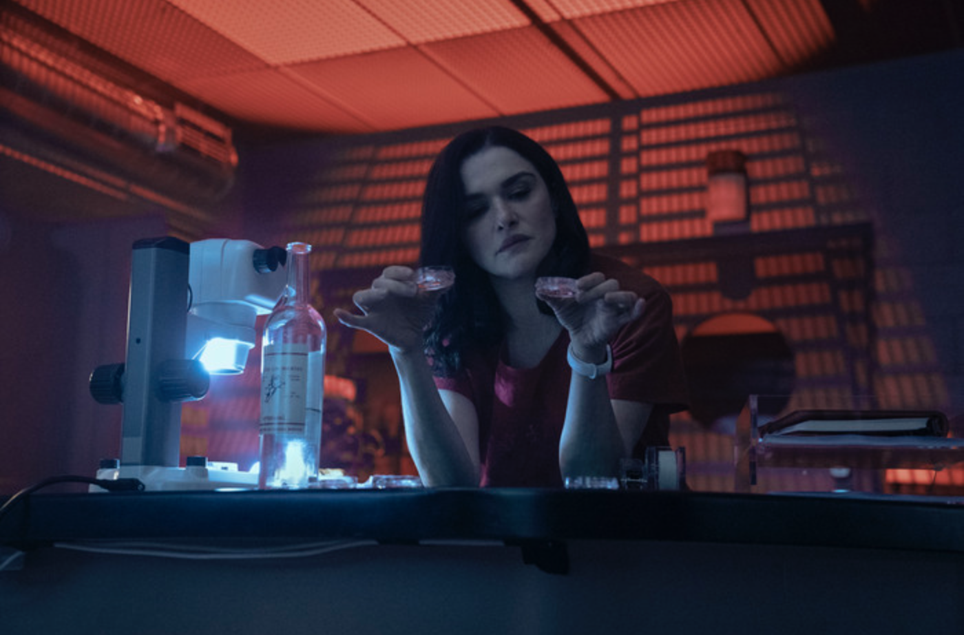
Particularly in Elliot’s lab space where very illegal and immoral things were happening.
“Alice and the writers did, obviously, a huge amount of research and spoke to many people, lots of OBGYN ‘s and people in genetic research and development. It was interesting seeing where people are realistically and then how much of that we could tweak up 10 or 15 percent in a believable way, in a way that really allows for the drama that we’re hoping for and that lends itself to the horror and the thriller aspect,” Magill recalled when discussing the lab’s usage of giant projection screens and elaborate instrumentation in a creepily red-dominated environment. “Many of our conversations revolved around how we render the science and blow it up to give that cinematic lens to it in a way that feels believable. As much as the science is amazing, it’s not necessarily the most cinematic thing in the world.”
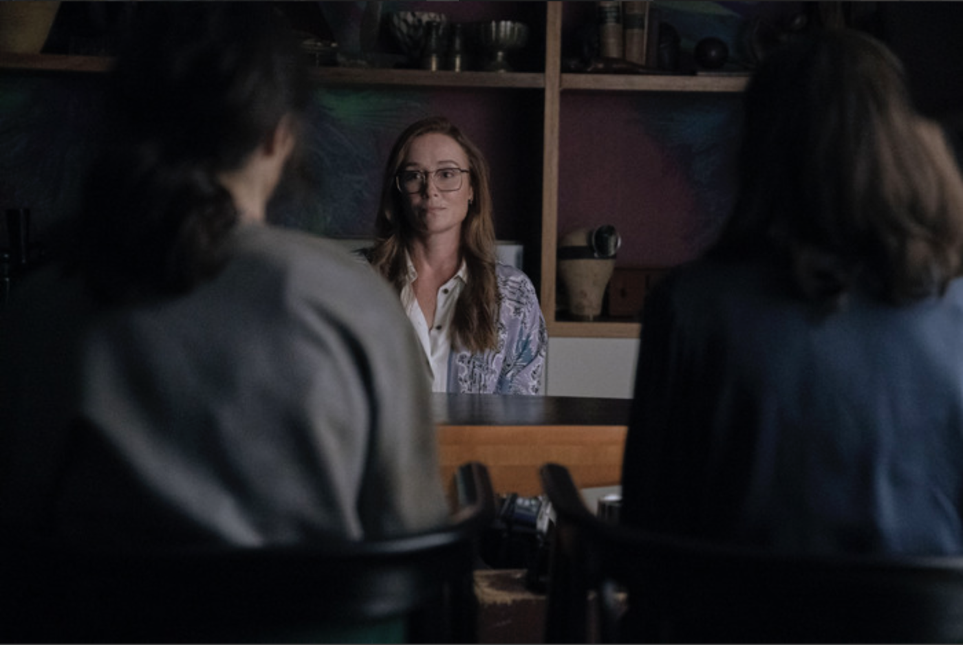
Outside of the birthing center, one of Dead Ringers most talked about sequences takes place at the home of venture capitalist Rebecca Parker (Jennifer Ehle). The elaborately modern space was designed to reflect the elaborate wealth of the characters reflected within, a world the Mantle’s sorely needed to eventually realize their own unique vision. Magill found her Parker estate in an historic home on Long Island that was designed by the same architect who built the Met Opera House in Lincoln Center. This estate in addition to a beautifully sculptured piece prominently featured in the episode became the focal point reflecting the generational wealth to which Rebecca Parker had access.

As Rebecca “collects” the Mantles as her newest investment opportunity, her surroundings were populated with artifacts and treasures indicating that Rebecca was likely a collector of physical items herself. Each item in addition to the architecture of the house lends subtle support to the brilliant dinner party set piece featured within the second episode.
“I leaned into this idea that she was a collector. A lot of the pieces around her we were able to bring in thanks to a relationship with a wonderful gallery in New York. The idea we had was that lighting the natural shapes of these items in very specific ways could accentuate the thriller aspects of the piece as well as underscore how wealthy she was,” Magill said. “There’s something very comical about when you see these things all together that I thought really hit the right tone of what Alice was trying to do in that dinner party.”
Other prominent spaces within Dead Ringers included the Mantle’s apartment in which Beverly and Elliot’s rooms highlighted their own individuality. Beverly’s space was rendered in a calming, Zen, near religious sanctuary way with symmetrical windows and an art deco bed with flowing curtains that echoed hospital drapery. Elliot’s chaotic personality reflected in her room’s sense of total disquiet. Her room features a messy, dirty aesthetic with a TV placed on the wall in an off-center location as well as clothes religiously strewn about in a red and green color palate with mustard floral wallpaper inspired by Van Gogh.
Their shared space, the bathroom, provided a thematic meeting ground for the Mantle twins.
“It just made sense to me that they should share this space. It really shows this extreme codependency and over-the-top busyness in each other’s lives. The doors were lined up so that you can see all the way through, and we had a very open shower and toilets,” Magill laughed. “All of that was very much intentional to help really show that very toxic, very intimate, relationship between the two of them.”
Dead Ringers streams exclusively on Amazon Prime.
https://www.youtube.com/watch?v=FA_XOruRFfU


![2025 Oscars: Can a Late-Breaker Still Win Best Picture? [POLL]](https://www.awardsdaily.com/wp-content/uploads/2024/10/gladiator-350x250.jpg)
