Throughout the past year, Bonnie Garmus’s Lessons in Chemistry became a page-turning bestseller. It was as popular in book clubs as it was in airports across the country. So, it was a no-brainer than AppleTV+ partnered with showrunner Lee Eisenberg to develop a limited series based on the novel.
Debuting last October, Lessons in Chemistry starred Brie Larson as Elizabeth Zott, the chemist who becomes a national inspiration to women. By hosting the non-traditional cooking show “Supper At Six,” Zott refused to dumb down the science of cooking. Rather, she leaned into it, empowering women across the country to stretch themselves in ways they never considered possible. It’s a fascinating story anchored by some of the best below-the-line crafts of the year.
Cinematographer Jason Oldak, splitting lensing responsibilities with Zachary Galler, helped develop a visual palette for the series that, among other attributes, reinforced the power dynamics frequently on-screen as Zott takes on the male-dominated scientific community. Oldak also partnered with the overall creative team to develop a lighting scheme for “Supper at Six” that visually represented the early 1960s period but provided modern (re: cooler, temperature-wise) lighting capabilities for the actors’ benefit. He also had the unique opportunity to film a significant portion of an episode from the perspective of the fan-favorite dog Six Thirty as well as capture frequent moments of open-water rowing.
Here, Oldak talks to Awards Daily about lensing Lessons in Chemistry, including how he accomplished some of the more challenging moments of the series.
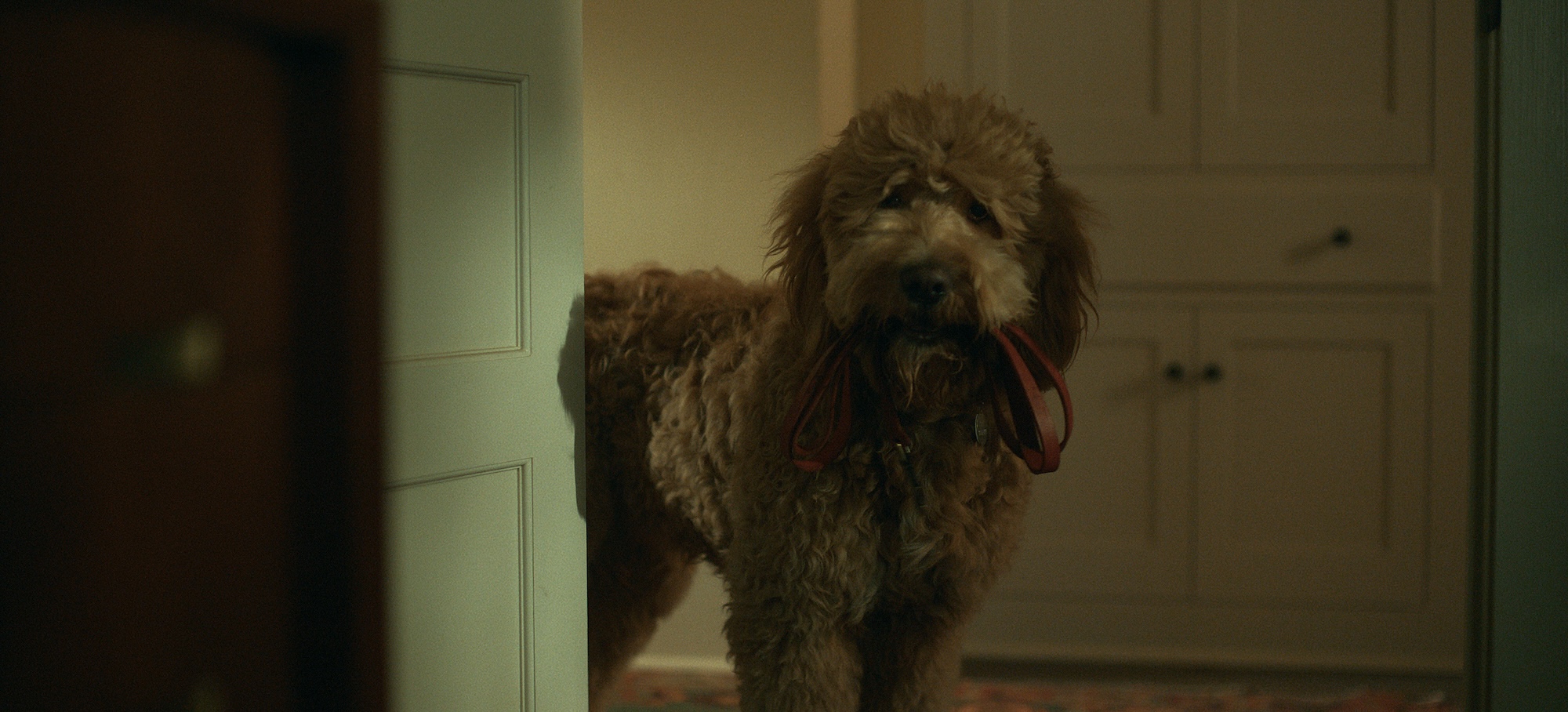
Awards Daily: Episode 103 begins with a sequence from the POV of Six Thirty, Elizabeth Zott’s dog. What’s it like for a cinematographer to need to work with so many dogs?
Jason Oldak: I remember in film school there was a saying: don’t work with animals and infants. All of a sudden, we had all of that in episode three and four, which was insane. The opening was challenging in a good way because the directors of episode three (Bert & Bertie) felt Six Thirty was really a cast member of the show like anyone else. So we had to create visuals that went with his voiceover.
Our dog wranglers were really great. They brought in all those other dogs and got Gus (Six Thirty) to be looking in the right perspective in the right way. At the beginning, we had to work out how to create this feeling that the dog just didn’t want to be there before running off. Then, we shot from a different perspective in the alley compared to what you see earlier in the season. It’s from the dog’s vantage point of going to eat and then, all of a sudden, Elizabeth appears. Throughout episode three, because the dog feels he is responsible for the death of Calvin [Lewis Pullman], we felt it was very necessary to shoot from the dog’s perspective whenever we’re seeing Elizabeth. We found the devices to do that as well.

Awards Daily: This episode starts on a very different tone compared to the others because it is the first one following Calvin’s death. Before that everything is sunny and bright, and this is very metaphorically and literally dark episode. Are you playing with lighting in this episode to reflect that more somber tone?
Jason Oldak: Yeah, absolutely. Let me rewind and just say that as a whole, because you’ve read the book, this what I love about this series is that each episode really feels like a chapter in her life. As you go through each chapter, she has different emotions, and other things happen: she has a baby, she falls in love, she becomes the host of a TV show, all these things. So the cinematography has lots of room to go in terms of tone. Zach [Galler] and I worked together to ensure consistency throughout the series. But also, with each episode because it’s such a different chapter in her life, we felt there was a lot of room for us to put our own stamp on it.
With episode three, as you were correct in saying, I really did go dark in terms of the lighting because of the grief and the sadness. After the dog montage at the beginning, the first thing we see of Brie is this montage that’s supposed to almost feel like everything in your life has just slowed down, morphed. You don’t know where you are, but you’re moving through it. I lost my father a long time ago, almost 15 years ago. When I received that phone call, it was the same feeling. It was like everything stopped. That was the moment we told the audience this is not what you just felt in one and two. From there, there was a lot of stillness, but that first montage showed this is where we’re at, and it’s not going to be fun.
Awards Daily: In episode three, are there differences in the way you light the Sloane home versus the Zott house?
Jason Oldak: Yes. If it was day in the interior of Elizabeth’s house, then we had a lot of light coming in from the windows and next to nothing inside. It was really more about the darkness, the silhouettes, feeling the depth but with windows rather than any kind of Hollywood lighting. I think the term naturalism in lighting is used quite often these days. I feel like I’ve achieved naturalism the best in this show from any other show I’ve done in terms of what naturalistic lighting really feels like to me. In Harriet’s house, there’s more warmth in general. Cat Smith, our production designer, created a warm palette with the color scheme in Harriet’s house, and we similarly used practical lighting as motivation when lighting the subjects. When Elizabeth comes over to talk to her, the lighting was brighter, but it was still on a darker tone because they’re now reminiscing about this man that they both loved in different ways. I think we definitely pushed for a darker tonality in her house and her world, but you can still feel the pain and the contrast.
Awards Daily: How does your lensing change in episode four as Elizabeth struggles to raise a child as a single parent?
Jason Oldak: We used movement a lot in the show, and not in a stylized way but in combining shots. Instead of doing three different shots, we would move through and try and make that work as one piece. There’s a lot of movement. I think in episode three there’s a lot of stillness. At the beginning of episode four, you’re getting something we don’t do a lot — handheld work. When she is having a baby and going through all of that pain and discomfort, we really wanted the audience to feel that with her. So we were very shallow and focused very close with our handheld camera. That juxtaposed with when she leaves the hospital. She has this baby now. There’s still stillness at the beginning because she doesn’t know what to do with her baby, but then as the episode progresses, we find our movement again, which is the continuity of the show.
Awards Daily: I love how you’re underscoring through lighting and cigarette smoke what a terrible person Dr. Donatti (Derek Cecil) is.
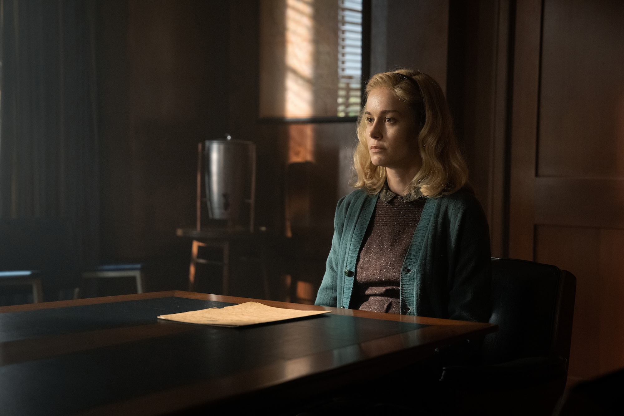
Jason Oldak: Yes, let’s talk specifically about the scene when she gets fired. We wanted this face off. They’re on either ends of this very long table. In terms of choosing the lighting direction, the sunlight faces Elizabeth, so it’s more pronounced. She is in control. She is not letting him run this, and she’s telling him how she feels and how Calvin would feel. This is not acceptable. His direction has much more darkness, and he is in the shadows. He’s a creep. Because of their showdown, we would push the camera in her direction, the same for his direction building from a wider shot to closeups for each. So as they’re building this scene in the edit, it’s the two of them facing off against each other, established by the shots we established.
There’s a lighting sequence in episode eight when they’re in the TV studio, and Phil Lebensmal (Rainn Wilson) threatens to fire her. At first, he’s positioned in a place where our light is more on his side. Then, he gets really close to her, threatening her. We purposely wanted him to walk out of whatever that light was that was edging him. I think that’s what lighting is all about. What’s going on in the story? What’s going on in the scene? How does that work for each character?

Awards Daily: Episode four starts with the birth of Elizabeth’s daughter, “Mad.” How did you and Bert & Bertie work out how you’d want to film this scene so that it stands out from traditional birth sequences?
Jason Oldak: First off, she is like the most uncomfortable being in that room, right? Even before the birth happens, she doesn’t want to be there. She doesn’t even want to have this baby. So that’s what you have to go in with in terms of tone and character. I love how we start the hospital scene: a woman has just given birth, and then we pull back to reveal this whole room of women in similar states. That’s what they did back then. You didn’t have a private room, not everybody at least. So as we come into to Elizabeth’s world, it felt like it was the proper time to switch to handheld. We had two cameras that just covered Brie in the most uncomfortable, claustrophobic way. With all the stress and strain she has, we wanted Calvin’s eventual appearance to feel ethereal, and that he is an angel that’s going to help her through it.
Initially, we talked about using a device called a swing shift lens, which creates different focus, but it wasn’t truly the right tool. I did a little bit of research, and the great Roger Deakins created a device when he filmed The Assassination of Jesse James called the Deakinizer. It comes in different focal lengths, and creates an ethereal/ halo like quality around the edge of your frame. You can angle the lens and do some fun stuff. We decided that was the right tool for the moment. So, with all the handheld camera movements and all the claustrophobia, when Calvin appears, it’s as if an angel has appeared to help her through the birth. Once the birth happens, we then go back to more of our normal way of shooting Lessons.
Awards Daily: Episode seven is the Calvin flashback episode. How does the cinematography change to reflect the change in period?
Jason Oldak: I have a fondness for that episode because this is where we go backwards, and we tell the story through somebody else’s perspective. It’s not just Elizabeth’s story anymore. It becomes “The Book of Calvin,” as it’s titled. Tara Miele was the director, and we both discussed the fact that, as we go back into the 1930s, Calvin is stripped of a family, stripped of a home, stripped of a lot of things, and taken advantage of in this orphanage. So, we wanted to create a world that had less color. When that flash of a camera bulb happens, we bring ourselves to 1948, and color is reintroduced. It felt appropriate in that moment to give this other world a different look. We collaborated with our entire team to reinforce the differences in tone through color, and I think it’s really effective. In the script, it only describes that flashbulb, and that really felt like a moment where you can see the difference in the two worlds.
Awards Daily: Tell me how you worked out how to capture the rowing sequences so authentically.
Jason Oldak: I’m going to talk about three things. The first thing is, the rowing was an element among many other elements in 107 between the two men writing letters to each other. The script had the letters and the voiceover, but it had very minimal screen direction in terms of what they’re doing physically. Tara and I really worked on what visuals we could create that worked with what the men were saying to each other. For instance, with the rowing, Wakely is talking about God and about the world. We knew that the rowing was going to work in that place. So, there’s a shot where the camera’s slightly higher looking down on Calvin. That was done on purpose to reflect what is said in the voiceover.
From a technical standpoint, we had a pontoon boat, a bunch of crew members, and a 35-foot crane. We had our Scorpio head on the end of it, and we were able to telescope and move accordingly with the row boat. The actors also had trained rowers that were able to bring their own boat out to where we needed it to be. It was all about finding the right placement for the sun to be somewhere where it’s working cinematically. I will give a ton of credit to our a camera operator because he nailed those shots. I mean, it was amazing. His name is Mikael Levin, and he is a big collaborator of mine.
Another thing about the rowing day is we shot all of that in December. We had a bunch of rowing work that’s in 108 and 107. It’s also in 105. Because of how TV and scheduling works, they weren’t going to go out to the lake for a small scene, so we shot these scenes altogether. We had a ton of work to do, and we also had to do it before the sun set at 4:30pm. So, it was a very heavily planned day, very challenging in a good way. We were very prepared and prepped it out. We got everything at the right time. Even in episode eight when Rosemarie DeWitt and Brie are walking alongside water, we got there right when the sun was hitting those trees. Sometimes you’re just on a show where everything just clicks. It’s just working, and I think it has to do with the people that are on it who know what they’re doing and everyone’s prepared. Everything clicked.

Awards Daily: Episode eight features Elizabeth’s last episodes of “Supper At Six.” How were you lighting and filming the scenes in the studio?
Jason Oldak: That was a challenge in many ways. Tara and I talked about how we’re not only shooting a segment of “Supper at Six” as you saw earlier. This is also a goodbye to her show, so we felt there were certain elements we wanted to create as almost an overall homage to the show. Basically, we show the setting up of the show: the audience filtering in, the cameras getting ready, and then her whole speech. Within the speech, it juxtaposes with Elizabeth in the dressing room, talking to who you later find out is the studio head. There were a lot of elements that went into that sequence. We had to pack that all in one day. We brought in a third camera just so we were able to get all of the angles we needed.
From a lighting standpoint, our gaffer [Len Levine] was a true collaborator. He is one of the best I’ve ever worked with. Len worked with our lighting rental company to get several hollowed-out Mole Richardson lights from the 1950s that we could see on camera and would be rigged above the cooking set. Each hallowed-out unit was retrofitted with various LED fixtures to illuminate the set properly. Back in the day, you’d have those old lights, and the set would be 100 degrees. If you’re there for an hour, then you start sweating makeup, etc. Directly above Elizabeth’s station, we placed light mats in scoop fixtures. They’re just an LED type of light: super controllable, low temperature, dim ability, and not hot at all. It was very clever. Everything we see looks period, but it’s lit in a 21st century way.
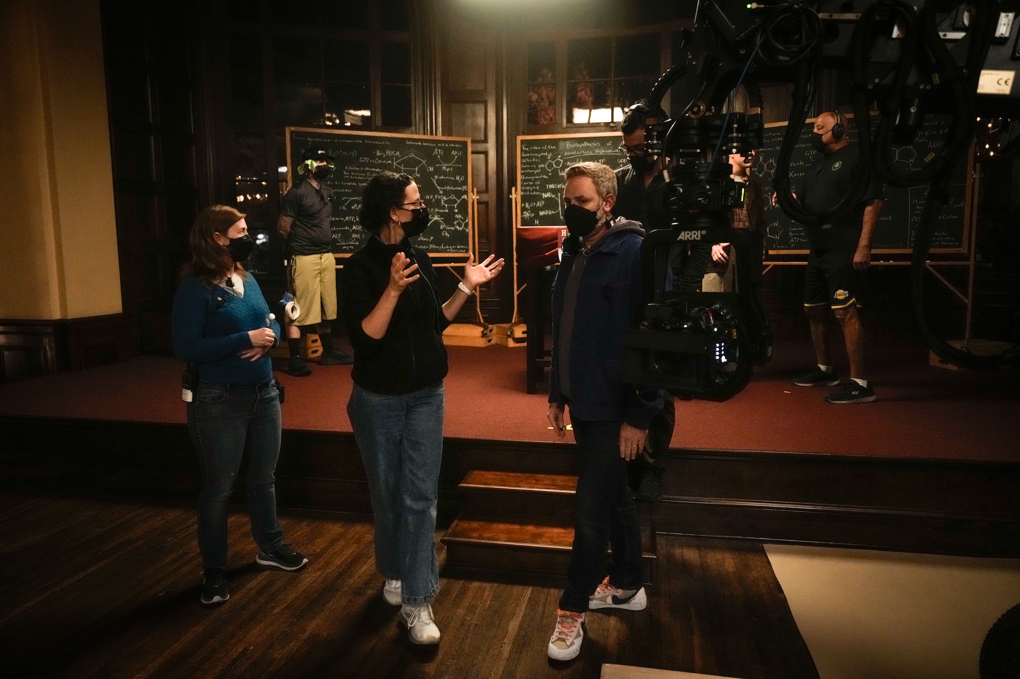
Awards Daily: You close the episode with Elizabeth as a professor in front of the class and staring directly into the camera. What’s behind that choice? The way the camera closes in on her seems to call back to the earlier scene with Donatti where the close-up reflects her control.
Jason Oldak: Yeah, you’re right. In terms of the push, I think the push is used a lot to emphasize that fact that she knows what she’s doing. She has focus. We’re doing that with the Donatti scene for different reasons. There, it’s a power thing, but she also had focus. She knew exactly what was going on in that room, and that it wasn’t in the handbook to fire her. In this moment, at the end, she is leading this class of students, and she is so in tune with where she needs to be in her life now. Ending on that moment where she says ‘Let’s begin’ is, first of all, an open ending. Where is she going next? It also gives determination, and I think that’s just an example of using the camera, using lighting, and using art to tell the story best.
Lessons in Chemistry streams exclusively on AppleTV+.


![2025 Oscars: Can a Late-Breaker Still Win Best Picture? [POLL]](https://www.awardsdaily.com/wp-content/uploads/2024/10/gladiator-350x250.jpg)
